Email is the powerhouse channel
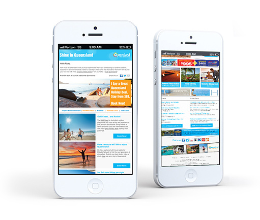
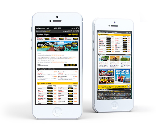
Based on its low cost and high returns is well known as the powerhouse of digital marketing. For many of our clients, email marketing is usually the highest converting of all their online marketing activities, generating sales at double the rate of both paid and organic search marketing, which despite being a distant second in the KPI conversion stakes, is usually much more expensive to implement. The uptake of mobile devices in Australia has brought with it exciting changes when it comes to the design and optimisation of emails to cater for this increasingly burgeoning segment.
Not convinced? Here are some cold hard stats:
• Last year in Australia alone the visitation to websites from mobile devices increased by more than 100%. Coinciding with that is the feedback from our clients who have experienced a spike in traffic coming from mobile devices – more than 30% of their overall traffic!
• According to Return Path in the last quarter of 2012, a vast majority used mobile devices to view the top 100 retailers’ email programs.
• On weekends and key seasonal holidays this can represent close to 60% viewing on mobile and less than 20% from desktop.
• According to Movable Ink, almost 60% of all email opens in March 2013 were on a smartphone. 34% of those were on an Apple device; 23% were on an Android. – Movable Ink “Email Opens, March 2013” (2013)
• 74% of consumers are either extremely or somewhat likely to show their mobile phone to a store cashier to redeem a discount code, barcode, or online coupon instead of printing the coupon and bringing it to the register. – BlueHornet “2013 Consumer Views of Email Marketing” (2013)
Read many more compelling stats here: http://www.emailstatcenter.com/mobile.html

Multiple devices
One of the more common behaviour trends when it comes to emails is for recipients to view emails across multiple devices, scanning and quickly reviewing emails on their mobile phone and then reading in greater detail on their desktop client.
Also of great interest is that 80% of consumers find reading marketing emails on mobile devices harder than on a PC. – eDialog, “The future of Mobile Messaging,” 2011
The 1-2-3 Best Practices of Email Marketing
Step 1 : Understanding your mobile traffic and the most popular devices
Knowing how much of your website traffic is coming from mobile devices and what the most popular devices are, is very easy to find out from most website analytics programs.
In Google Analytics this can be seen in Audiences > Mobile > Overview + Devices.
It’s also well worth looking at what conversion rate differences there are between desktop traffic and different mobile devices. It would be quite common to see conversion rates for mobile devices to be at least half that of desktop when a website is not mobile optimised.
Having a mobile optimised website that is either a responsive or a mobile site (see Sportsbet for a good example of a mobile site done well) is now a critically important tactic to implement.
Audiences that have a bad mobile experience with your brand are more likely to quickly move onto one of your competitors that does deliver on their demanded mobile experience.
To understand mobile, Msite and app differences have a look at this great presentation from wearethenest.
Step 2 : Optimise your website and email campaigns for mobile
Optimising your website and email campaigns for the highest penetration of devices that are visiting your website and from your email campaigns is critically important. Typically for Australia audiences this is iPhone (iOS) and Android devices.
Step 3 : Designing Email for Mobiles and Desktops
Viewing email is the No. 1 Internet activity on mobile, so you need to be sure your message can be viewed and acted on easily in all screen environments, from smaller 1×2-inch screens of a basic smart phone to a 15 inch laptop and of course larger than 21-inch desktops.
Make your email mobile touch friendly for “fat fingers” so that all users can click the call to action buttons accurately and easily.
There are various options available for designing and coding email for mobile devices, including a responsive approach, along with scalable and fluid implementations.

Mobile Email Design – The Key Take-Aways
Make sure you provide your customers with the most relevant and easy-to-click content in a mobile environment.
• Email width should be less than the screen width of the mobile device it’s being displayed on.
• Fonts are at least 13px for text and 25px for headlines for easing scanning and reading.
• Implement “Fat finger” touch-friendly call to actions buttons.
• Your email template and campaign looks good on both iOS and Android devices.
• Offer plain text and HTML versions of your email as well as online version links.
• Use strong descriptive alt text under your main images and call to action buttons in case they don’t display.
• Optimize landing pages and forms your email links to.
And finally, here’s a bit of a checklist to see if you are ready for an email marketing template makeover?
• Does your brand’s email look great when your read it on a smartphone or any other mobile device?
• Can you act on it easily, can you click on the desired links and buttons?
• Have you included local information of real value to the recipient (local store location, phone number, hours of operation, support, FAQs)?
• Does it contain personalised content for the recipient based on their user preferences, their actions on your digital assets or their previous behaviour with email campaigns?
• Is your brand’s email socially connected, are your social media profiles promoted and do you make it easy for your audience to share the email or content across their social network?
• Is your brand’s personality and image reflected in the design?
• Does your email work when images are turned off and when viewed and acted on in a preview pane?
If you answered NO to any of the above questions, then it’s time for an email marketing template makeover to make sure you are delivering the best experience for your customers and prospects, no matter what device they engage with your marketing messages and communications.
From implementing mobile optimised templates for our clients, we have seen click rate increases of more than 30% – helping take email marketing even further ahead in the conversion and ROI stakes than all other digital channels.
To understand more about our email marketing services, our experience with mobile optimised templates or to contact us to discuss your brand’s email marketing requirements with us.